


What does great Notam Design look like? (or, how we kill the Nastygram)

Thread Starter
Join Date: Sep 2000
Location: Aotearoa
Age: 54
Posts: 63
Likes: 0
Received 0 Likes
on
0 Posts
What does great Notam Design look like? (or, how we kill the Nastygram)
Hi all - the Notam Team is looking for help in rating the best starting point for a new Notam Design. See the ideas below.
What does great Notam Design look like? (or, how we kill the Nastygram)
Original article here.
If you were to ask a 2nd grade class to design a super readable, human-friendly, clear briefing for pilots, they’d probably come up with some good ideas. Kids have a good eye for design, and spend a lot of time drawing and coloring things in. They also have a better ability to keep concepts simple, and see problems in clearer ways than we super-smart adults do.
What they would be very unlikely to do, is propose the telegram format nonsense that we currently use (let’s call it the Nastygram). Kids would know this is dumb. People can’t read it.
Even more unlikely, if we were to imagine a scenario where there was a tender to design a Briefing system for pilots (adults this time), is that the Nastygram would win. Someone would get fired if that was even proposed.
So, if we start from scratch, what might it look like? We thought we’d ask some people with ideas – you know, designers. Here’s what we got. They used revolutionary concepts like color, plain language, normal case, and flags.
Feels like a good starting point for a discussion.
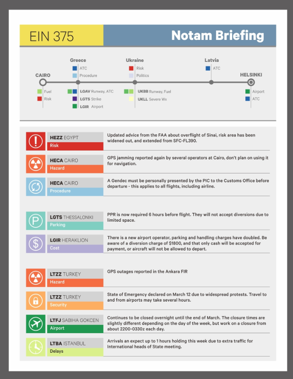
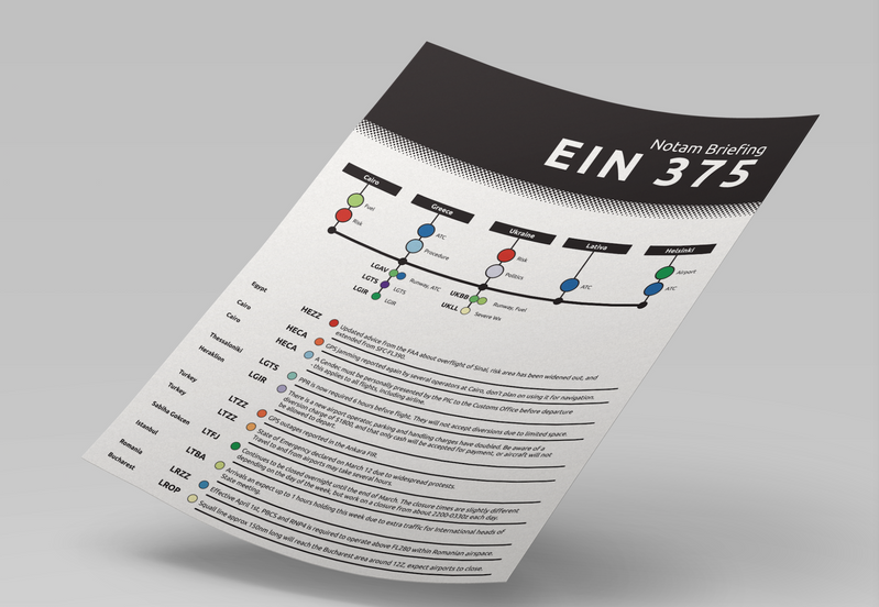
Design1: The Colors
Design 2: The Condensed
Design 3: The Flags
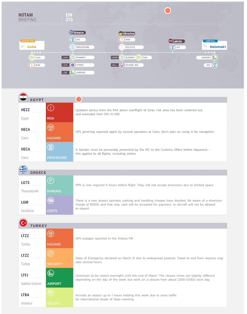
Design 4: The Timeline
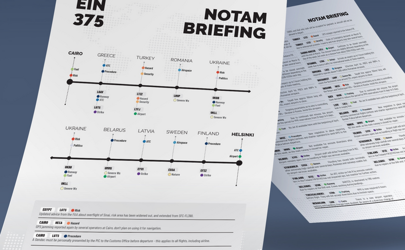
Four starting points. Will you tell us which one you like best?
We made a tiny survey (30 seconds) – just choose your favorite here.
The design group in the Notam Team will use your feedback! Thank you!
More at: fixingnotams.org
What does great Notam Design look like? (or, how we kill the Nastygram)
Original article here.
If you were to ask a 2nd grade class to design a super readable, human-friendly, clear briefing for pilots, they’d probably come up with some good ideas. Kids have a good eye for design, and spend a lot of time drawing and coloring things in. They also have a better ability to keep concepts simple, and see problems in clearer ways than we super-smart adults do.
What they would be very unlikely to do, is propose the telegram format nonsense that we currently use (let’s call it the Nastygram). Kids would know this is dumb. People can’t read it.
Even more unlikely, if we were to imagine a scenario where there was a tender to design a Briefing system for pilots (adults this time), is that the Nastygram would win. Someone would get fired if that was even proposed.
So, if we start from scratch, what might it look like? We thought we’d ask some people with ideas – you know, designers. Here’s what we got. They used revolutionary concepts like color, plain language, normal case, and flags.
Feels like a good starting point for a discussion.
Design1: The Colors
Design 2: The Condensed
Design 3: The Flags
Design 4: The Timeline
Four starting points. Will you tell us which one you like best?
We made a tiny survey (30 seconds) – just choose your favorite here.
The design group in the Notam Team will use your feedback! Thank you!
More at: fixingnotams.org
Last edited by AF1; 16th Nov 2019 at 19:19. Reason: updated links

This is a great start. The trouble with the images above is that you only have a few NOTAMS per airport.
It's not uncommon in AUS to have 40 NOTAMs per airport. Indeed at the moment a MEL - SYD -BNE flight has 20 MEL NOTAMS, 39 SYD NOTAMS BNE 24 NOTAMS and finally for area NOTAMS....56 YBBB and 82 YMMM. That's 221 before you even get to the weather, or enroute alternates. Not every pilot has access to dispatch departments that filter this for you.
And I'm sure there are places with worse.
Last edited by compressor stall; 17th Nov 2019 at 09:15.

Join Date: Jul 2007
Location: Germany
Posts: 1
Likes: 0
Received 0 Likes
on
0 Posts
The FAA need to get a grip of American airports issuing 50+ notams. Furthermore, the notams are ordered not in importance order, instead are smattered through based upon date of issue. There needs to be a clearer way of stating X runway is closed between certain times, whether Y instrument aids are available. a pictorial/jpeg of current airfield work in progress would also cut out around 50-70% of all notams currently issued. Airfield work in progress shouldn�t be issued for more than 2 weeks, that�s what we have nav plate updates and an AIRAC cycle for. Perhaps a table, with each runway and a simple colour code as we whether properties of that runway are affected. You could have columns for length, instrument aids, closed turnoffs, that sort of hing. One person should be collating the data and summarising, instead we had a system whereby every pilot has to make a cognitive summary of a load of text.
There needs to be much greater global standardisation of language used in NOTAM. if I search for CLSD, it should come up with all closed facilities, I shouldn�t have to go back in and have to search for closed.
Finally, gaffing off airfield closures to an AIP entry and not having them embodied in terminal charts is just downright lazy.
Join Date: Feb 2013
Location: 60 north
Age: 60
Posts: 17
Likes: 0
Received 0 Likes
on
0 Posts
Is it open, does it have gas!
If yes and no.
Round tanker.
The Wolf Wolf cry of silly notam has become a safety hazard.
I have to say some airports are good, with one or max 5 open and relevant notams, but most looks like they are going for some world record of irrelevant stuff.
Like windmills, cranes and resurfacing the locale flying club BBQ pit.
Is ICAO working on any guidance to improve on the Notam by relevance?
Regards
Cpt B
